

Creatives Digitals
A modern, typography-led business site for a Dubai creative agency — clean grids, bold type, and the restraint that comes with a confident brand.
The brief
A site that belongs on the same shelf as global agencies.
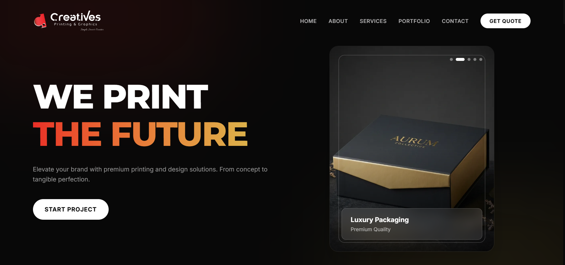
Creatives Digitals wanted a site that felt at home next to the global agencies they share shelves with in Dubai — so the design language is unapologetically modern: generous whitespace, a typographic system doing most of the heavy lifting, and photography that earns its placement.
Every page is a grid. Every element respects it. The result is a brand surface that feels effortless — which is, of course, the hardest kind to design.
What we delivered
The four rules the site lives by
- Typography-led layout system — a tight type scale doing the visual lifting.
- Grid-first page structure — every element snaps to one shared grid.
- Restrained motion — hover states, reveals, subtle parallax, never a distraction.
- Design-system thinking — tokens, spacing, type scale defined up front.
Challenges
What we had to solve for
01
Punching above weight in Dubai
The site had to sit comfortably next to the websites of established global agencies that Creatives competes with locally.
02
Showcase without overwhelming
A creative agency's work is the product. Presenting it without the page turning into a mood-board dump takes real design discipline.
03
International polish on a tight timeline
The agency wanted world-class feel without a multi-month build cycle — which meant design decisions had to be right the first time.
Our approach
How we got there
01
A minimal system, rigorously applied
Fewer building blocks, but every one considered. The site looks expansive because the vocabulary is small and consistent.
02
Work-first hierarchy
Portfolio pieces lead, copy supports. Visitors see the quality of work before they read anything about the team.
03
Design-system thinking from day one
Tokens, spacing scale, type scale — all defined up front so the site can grow without visual drift.
Pages & screens
A look across the site
More screens coming soon. For now, the live site tells the full story.
Results
What changed for the business
01
International competitiveness
The agency can now pitch alongside global shops without the website being the weak link in the brand.
02
Higher-ticket conversations
The site's polish has helped the team open dialogue with larger clients than the previous site was bringing in.
03
A foundation that scales
New work, new services, new offices — the design system is built to extend without rework.
Client testimonial
“Our site now sits comfortably next to the global agencies we pitch against. The ShineUp team took our brief and came back with design decisions sharper than ours. We've noticed the calls coming in are different.”
Creatives Digitals
Dubai, UAE
Next project
QSAT E-commerce
E-commerce · Full Auth
Need a site that looks the part?
Modern design language, international polish, and a system that scales as your brand grows. Let's build it.
Start a project